Search:
Categories
Popular Posts
- Toolmaking We shape our tools, and thereafter our tools shape...
- Science's Lingua Franca is a PatchworkThe dominance of English in science can obscure the contribution...
- Why Use R? R's 3 Core Strengths: Simplicity, Power, FlexibilityIn my experience, most biologists justify their continued...

In previous blog posts, we introduced and implemented the Grammar of Graphics plotting concept. Here, we want to show how implementing this framework in R allows for the efficient, flexible and transparent production of reproducible plots that effectively communicate key messages.
This data set comes from Lenka Forkelova, a student of one of our Data Visualisation workshops held at the Max Planck Institute for Biogeochemistry in Jena.
Case study: Sugar Concentration in Peppermint
Lenka studies how climate change affects sugar production in peppermint, an economically important crop. In one experiment, she measured sugar content of plants grown under different conditions. Her variables can be broken down as such:
Continuous variables:
- Sugar concentration
- Time
- 2-3 time points over several weeks
Categorical variables:
- Sugar
- 4 categories: saccharose, glucose, fructose and inositol
- Plant part
- 4 categories: roots, stems, young leaves and old leaves
- Carbon dioxide concentration
- 2 states: low or high
- Water content
- 2 states: drought or watered
Together these variables made up 140 unique groups, and with her biological replicates, Lenka had 988 observations to contend with. She used R to create the plot below (mean and standard error are plotted, click on the image for a larger version):

Although there are some concerns with this plot((Namely that the standard error is being plotted instead of the standard deviation, that the time and concentration (x and y-axes) scales are all the same size but different values, and there is a considerable amount of over-plotting. I have addressed these issues in the final plot, but that is not the focus of this article.)), it is a fine first attempt at creating a meaningful representation of the data. Nonetheless, it is difficult to get an overall picture of the key message. Importantly, the way this plot was generated makes it difficult to rearrange elements which would allow us to gain true insight into the data. The reason is that each sub-plot, including each line, was made individually and later arranged on a grid. The code is long, repetitive and error-prone. It is transparent and reproducible, but neither efficient nor flexible. How can using the Grammar of Graphics help?
The Grammar of Graphics Approach: Efficiency and Flexibility
Lenka mapped each of the 6 variables to a different aesthetic. As is typical, concentration was mapped to the y-axis and date to the x-axis. Choosing the optimal mapping scheme for the remaining four variables is tricky. Consider Lenka’s original mapping scheme and four alternatives:
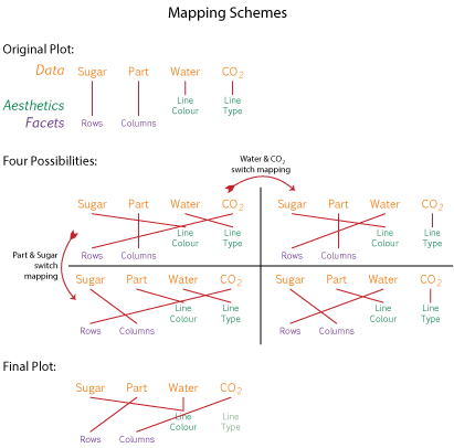
Changing between mapping schemes is both tedious and difficult given the style in which the original plot was created. This is where the beauty of the Grammar of Graphics comes in. Once we understand that we can rearrange mapping in our plots like grammatical elements in a sentence, we can easily generate plots with a variety of mapping schemes. The plots using the four alternative mapping schemes are shown below (click to enlarge):((I have left out Inositol, since it does not show any interesting trends.))

The choice of mapping scheme depends on the message that the plot should communicate. The final mapping scheme (given above) produces the following plot:

Here the plant parts are vertically arranged as we would find them in an actual plant. Carbon dioxide concentration increases from the left to right columns and tints of each sugar’s colour mapping are used to denote water state. It is now possible to view a trend in the data set: sugar concentration increases over time under high carbon dioxide conditions, and even more so under drought conditions, in all plant parts. Sucrose consistently shows the most dramatic effect.
Conclusion
In this post I have attempted to illustrate the application of the Grammar of Graphics in a real-life situation. Just as results need to be precisely and clearly expressed in text, the same holds true for graphics. These topics are discussed in more depth in our Data Visualisation workshop, including a comprehensive applications component, giving participants the opportunity to develop their own visualisation solutions.